Branding for influence, technology for awareness, promotion for efficacy

Gtsino
Gtsino is a Canadian cross-border e-commerce & fintech industrial park.
Start Date
2022
Duration
N/A
Client from
Toronto, ON, Canada
Design Concept
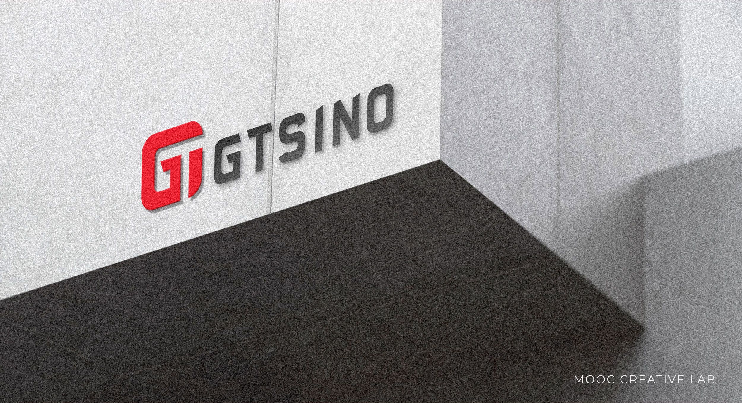
The Logo design of Gtsino combines the first two letters g and T of the brand name, and the shape of the square represents the relationship between the company and the Internet, APP and e-commerce platform. Sans serif fonts are modern in the field of technology. The unique tangent line in the name echoes the logo. China Red highlights the brand as being from a Chinese cross-border company in Canada.


