


Genki Soymilk 元气豆满
Genki Soymilk is a beverage and deserts brand. Nowadays, as people pay more and more attention to health issues, soy milk has become the second beverage to replace milk. The tonality of the brand is dynamic, which is expressed by colors and illustrations.
Start Date
2023
Duration
N/A
Client from
Toronto, ON, Canada
Design Concept
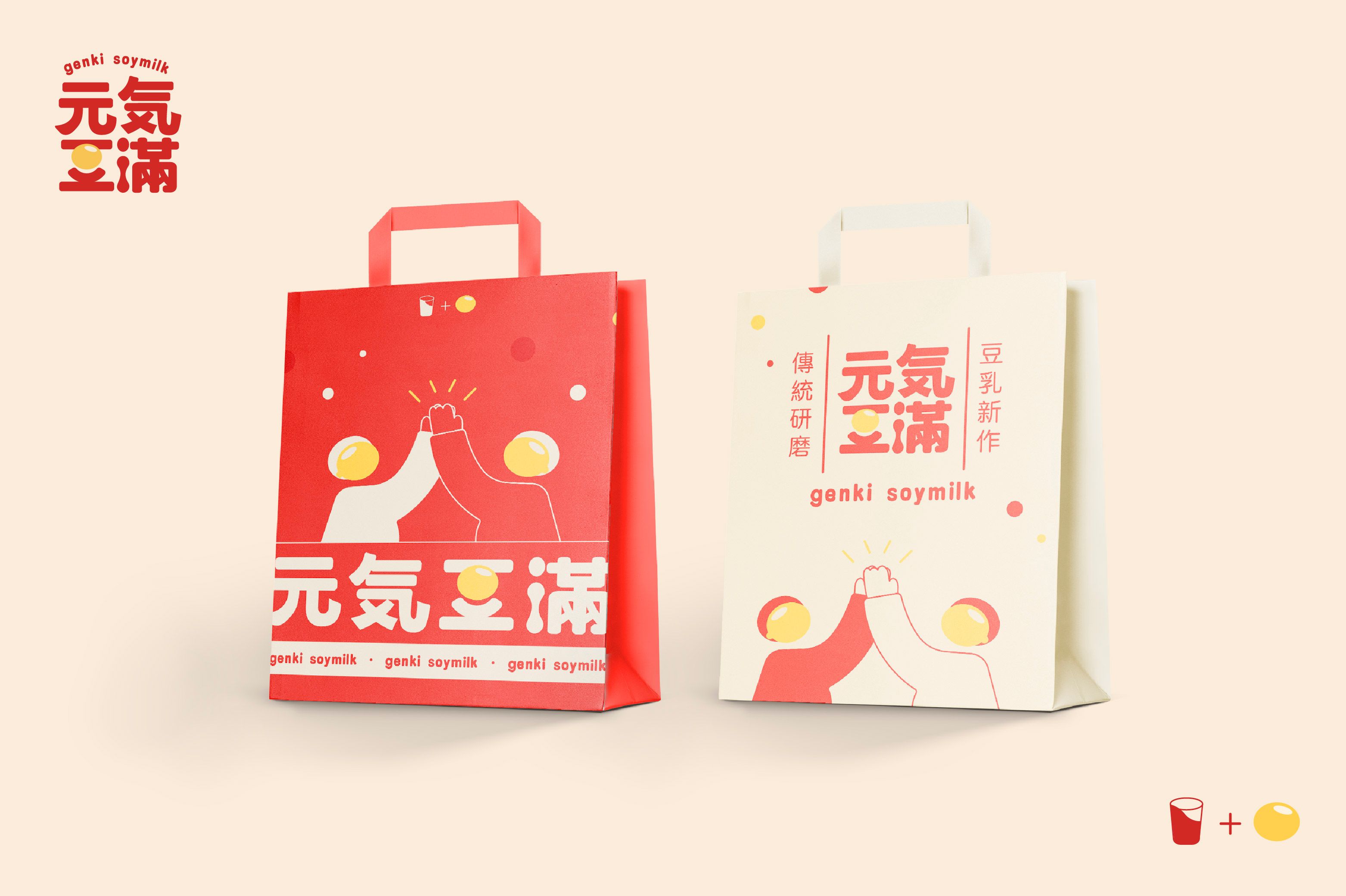
The logo uses a contemporary and popular rounded font. Emphasis on traditional eastern square-rounded aesthetic, we modified the font by combining elements of soy beans and the waterdrop shape of the dripping soy milk with the typography. The bright soybean yellow color combined with typical Chinese red and ink black emphasizes the brand's deep cultural roots. Dou Man is the mean IP for genki soymilk 元气豆满. We provided serval illustrations around soy beans and his movements. Emphasis on “young”, “ engaged” and “dynamic”, these illustrations show the brand tone more vividly as an aid. In addition, they can be used on different applications.